To sign up for our daily email newsletter, CLICK HERE
It’s important that your prospects have a good time on your website, as this will determine whether they’ll be coming back and what people think of your business.
So, to ensure that you’re providing the best experience, let’s take a look at five techniques you can use to create a positive user experience for visitors on your website.
Make sure your site loads quickly
According to Akamai, 53% of mobile site visitors will leave a page if it takes longer than three seconds to load. This means you need to make sure that your website loads as quickly as possible.
Semrush advises that you keep your page load time between 1-2 seconds, and it’s advisable to go with this if you want to keep your bounce rate low and prevent visitors from leaving your site.
To keep your page load speed down, you need to make sure that you’re optimizing your images by using the appropriate file format. Formats like JPEG and PNG are widely used to reduce your file size while helping you retain the quality of the image.
Web hosting also affects your page load speed, so it’s important that you go for a hosting plan that can support your website and the traffic it generates. For instance, if you started your website on a shared hosting plan, it can slow down your load time when you begin to generate more traffic. If this is the case, you might want to consider upgrading to accommodate your traffic needs.
You can also use Google PageSpeed Insights to see your overall website performance score and get recommendations that will help you identify and fix the issues that affect your load time. To give you a better idea of how to use the tool, here’s a guide from Neil Patel on how to score a perfect 100% on Google PageSpeed Insights.
Ensure your site has an intuitive navigation
Aside from implementing a simple and clean design for your website, you should also try to optimize it by making sure it’s incredibly easy for people to find exactly what they need. If they can’t, they’ll be far more likely to leave your website without making a purchase. This is why you should ensure that your site has an intuitive navigation menu.
There are a number of ways you can help people navigate your site intuitively — it could be by the type of person they are (for example, student or teacher), by product type, or by the problem they’re having.
Some other common practices for intuitive navigation include placing your menu in the header and footer of a page (where people expect them to be) or using common names for your web pages, such as about us, blog, and contact us.
Now let’s look at examples of sites that use intuitive navigation menus to see some of the different approaches you can take.
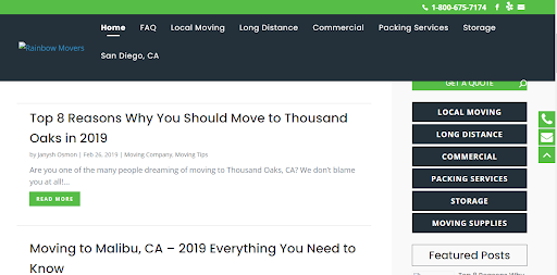
Rainbow Movers is a full-service moving and storage company, and they do a great job of using intuitive navigation on their website.
For instance, they’ve created separate web pages for their different offerings, like local moving, long-distance, or packing services. And all of these options can be found very quickly from their main menu, making life easy for their website visitors. They also have an extra mini-menu on the right side of their website that includes links to these pages, so people can still access them as they scroll.
All of these tactics make it super easy for people to find the information they need at a glance, and it also contributes to a positive user experience for website visitors.
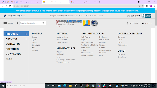
SchoolLockers.com produces a variety of locker types for their customers and, on their homepage, you’ll find that their navigation menu has been designed to show visitors the different types of lockers they make according to locker type, material, or manufacturer.
They display all the available options, and breaking things down like this is a great way to streamline their buyers’ search and make it easier for people who might want to search for specific features and more.
These two are great examples of intuitive menu designs, and you could consider emulating what they’ve done so you can also improve the user experience for your website visitors.
Make it very easy for website visitors to get in touch
If someone has a question or concern, they’ll want to contact you. And, if they can’t do that very easily, they might leave without making a purchase and never return. So, you need to make sure that your contact options are clear and very easy to use.
You can do this by highlighting your contact options on different pages of your site. This means making sure your phone numbers or email addresses are highlighted on the headers or banners of your web pages so visitors can easily see them without having to search your site for a contact page.
To give you some inspiration, let’s study a website that has done a good job of making it easy for customers to get in touch.
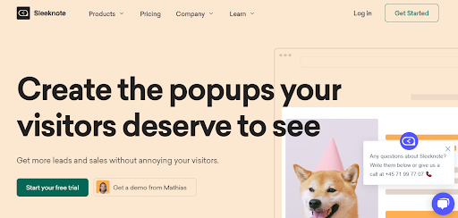
Sleeknote is a company that provides a lead generation tool to help eCommerce businesses engage their customers. On their website, you’ll see that they highlight their phone number in a small comment box by the side of each page so people can call and ask any questions. They also have a chatbot feature on their site that helps connect visitors to their customer service team.
By placing these contact options on each page, they make it very easy for people to reach them to ask any questions. And it also helps to make their user experience better.
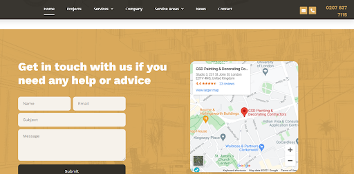
Let’s also take a look at how the team at GSD Painting and Decorating makes it easy for website visitors to get in touch. On their website, you’ll see that they‘ve highlighted their phone number so people can call and ask any questions, and they’ve also added an email option for those who prefer to write down their thoughts.
And, scrolling down their page, you’ll find a contact form that visitors can fill in if they want to send a message to the company or are in need of any help or advice. If you haven’t done so already, you should also try to provide multiple contact options like these companies have done, as they make it easier for potential customers to reach you.
Provide clear calls-to-action so visitors know what to do next
A call-to-action (CTA) is a prompt that tells your website visitors exactly what you want them to do on your site. CTAs are very important for providing a positive user experience because they act as a guide for people who might not know which action to take when they get to your site.
To create clear and strong CTAs, you’ll want to use command verbs that compel people to take action. Some examples are “subscribe”, “get”, or other action words that specifically relate to what you are asking visitors to do. You should also try to use bright colors for your CTA buttons to help them stand out against the background of your web pages.
To give you a better idea of what a strong CTA looks like, let’s examine some examples.

Guardian Home Care is a company that provides in-home care assistance. On their website, they have a page that provides information on their home care services for the elderly. They use a variety of CTAs on the page, including “learn more”, “get started”, and “call (their phone number)”.
“Learn more” speaks to new visitors who want to get more information about the company, “get started” is for prospects who are ready to convert to customers, and the last CTA is for people who wish to speak to a company representative and ask specific questions. All these CTAs do an excellent job of letting people know what action to take next, and they help make sure that people aren’t left wondering what to do on their site.
Let’s also look at the link-building services page on our website. Just like the first example, we also have multiple CTAs that tell different website visitors what steps they should take on our site.
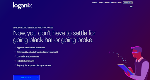
We use a “get started” CTA to attract people who are ready to begin their link-building journey with us, and we’ve also included a “read case study” prompt for prospects who are considering their options and want to see how we’ve helped previous customers. By using distinct CTAs to target different visitors, we’ve managed to ensure that everyone has a great experience on our site, regardless of what stage they are at in their buying journey.
These are good examples of how you can use calls-to-action to provide clear direction for website visitors and you can consider doing the same for your website.
Ensure your website is accessible
When creating your website, you should also think about making it accessible so that anyone can use it — even those with certain impairments that require special accommodations.
One of the ways you can make your website accessible is by adding alternative text to your images so screen readers can understand them. If you’d like to find out more about how you can create content that’s accessible, Venngage has an excellent guide on how to create accessible infographics and content for visually impaired people.
You should also make sure your website’s text contrasts well against the background to make it more visible. Lastly, try transcribing your videos to make your website more accessible to hearing-impaired people, so they don’t miss out on what you’re saying.
To give you some inspiration, here’s an example of a business that does an excellent job of making sure its website is accessible.
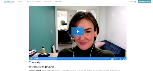
Copyhackers is a website that teaches copywriters and other business owners how to become better at writing content that sells. And, on their site, they have many tutorial videos on copywriting topics. The great thing about these videos is that they also include a transcript for people who might have hearing impairments.
Take, for example, their tutorial on how to organize your copywriting research. The post includes the tutorial video and also the word-for-word transcript of the video. It shows people that they consider website accessibility when creating content. It also provides a very positive experience for people who might prefer to read content, rather than watching it.
To show that you care about the accessibility of your website, you’ll want to emulate this strategy by providing detailed transcripts for your content that’s in video form.
Summary
If you can give visitors a positive experience on your website, they’ll have no problem returning to your brand, and they might even be encouraged to tell other people about your business.
So, you’ll want to implement the tips we’ve outlined in this article. You can start by improving your page load speed, implementing intuitive site navigation, and making it very easy for visitors to get in touch with you if they have any questions or concerns.
—
Author bio & headshot:
Adam Steele is COO and co-founder of Loganix, which is an SEO fulfillment partner for digital marketing agencies and professionals. The company provides the SEO services that businesses need to grow and achieve their goals. If you enjoyed this article, you can find more SEO guides and templates on the Loganix blog.