To sign up for our daily email newsletter, CLICK HERE
You want your landing page to give the right impression, generate trust, and entice visitors to interact. It’s hard to know where to start with web design for a professional landing page. There are so many elements that you need in order for it to be successful. You have colors, fonts, images, etc., all of which must work together seamlessly if you want your site visitor on their way quickly. Luckily, we’ve compiled some best practices from experts in the field so that you don’t have to worry about designing from scratch again. Here we have shared some effective hacks to build a professional landing page.
#1 Engaging and Relevant Content:

Quality content is one of the best ways to get people to share your landing page. Low quality, boring or irrelevant content can cause a visitor to bounce from your site immediately. Think about what you want visitors to do when they visit your website, and write accordingly.
There are many different methods for improving engagement on a professional landing page:
- Have an attractive, eye-catching headline.
- Ensure the copywriting is spot on and flows well together.
- Make your call to action stand out from other elements on the page, so it’s easy for visitors to find. The best way of doing this is by using a contrasting color against the background or placing it somewhere that’s highly visible.
- Avoid using too many sentences as it can cause the page to look cluttered and over complicated. Try to use short paragraphs with one thought per paragraph for maximum impact. This will help keep visitors focused on what you’re saying, rather than straying off-topic or losing attention when trying to understand your message.
#2 Design an Attractive Logo

Your logo is the first thing that visitors see on your company website. A good, attractive logo can make or break a business. Usually, you have to hire an expert designer for making professional logos, but there are some simple design hacks that anyone can use to create cool-looking logos without any help from others. If you are on a budget, you can try a free logo maker tool to design an intuitive logo for your business.
#3 Keep the Layout Simple

The landing page should be easy to read and navigate. Limit the number of elements on the page in order to do this. If there are too many elements, people will get overwhelmed when trying to find what they’re looking for; therefore, it will decrease your conversions. If you are using a newsletter signup form, the call to action should be prominent. You want people to know what they need to do in order to get your product or services, so don’t hide it on an inconspicuous part of the page where no one will see it.
#4 Add Attractive Images to Your Landing Page

Images are an integral part of any landing page. They help to capture the attention of your audience, and people tend to remember images much more than plain text. However, you should use them with care because they can also make or break a landing page design. If used inappropriately, images might draw unnecessary attention away from other important elements or fail to convey the message you are trying to send.
#5 Make Your Landing Page Mobile Responsive

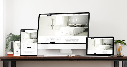
Mobile visitors are more likely to make a purchase than desktop users. They’re also less patient, which means they tend to leave if it takes too long for your landing page to load or respond in any way. If you don’t have an easy-to-use mobile version of your landing page, then these customers will be lost. Your landing page is not complete without a mobile version of your site, and this can be done using responsive web design (RWD). With RWD, you only need one code base to develop for all devices – desktops, tablets, and smartphones. A single codebase also makes it easier to maintain just one website rather than multiple ones, which means lower costs.
#6 Allow Social Sharing

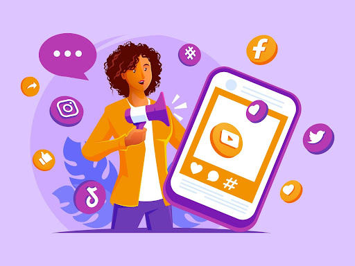
A lot of webmasters forget to enable social sharing for their landing pages. It’s important because even if you have a great design, nobody will know about it unless they share the page with someone else. So, make sure that your visitors can easily use Facebook and Twitter on your site so that others can find out about it too.
Social sharing is important for a site to have because it helps the information on the web page reach more people. If someone shares something that they found interesting, then other people can see what they are interested in also, which makes them want to read about it too. It’s an effective marketing strategy, and you should take advantage of it by adding the social sharing buttons on your site.
#7 Choose The Right Colors

For a professional design, choose colors that will work well together and look good on all devices. A landing page is the first part of your website people see when they land from search results or an advertisement, so it needs to be aesthetically pleasing without turning off potential customers with bright neon colors or unappealing shades.
Conclusion
A landing page is where all your hard work comes together. Everything you’ve done to get people there should be displayed well on the page, and it needs to convey what your company does as concisely as possible while giving visitors a reason for scrolling down or clicking through to other pages of your website.