To sign up for our daily email newsletter, CLICK HERE
Have you ever been tasked to do a presentation at work and find it difficult to get your point across? Your bosses’ and colleagues’ eyes are looking at you nonchalantly as beads of cold sweat trickle down your face. Everything is pretty much going south fast.
Wish you had an online graph maker didn’t you?
It’s too bad because you know you have a thousand great ideas, but somehow nothing is just clicking and connecting. Presentation is finally over, and you head home and start to wonder where you lost them.
If this is familiar to you, then you should ask yourself — Did I use data visualization to get my point across? If you’ve used graphs and charts in your presentation, did you use them effectively? These are very important questions you should be pondering yourself.
Effectively using a graph maker and charts can turn the main points of your presentation into something memorable for your audience. This is something that is also called “Data Storytelling.” In a nutshell, this means that your data is presented in such a convincing and memorable way that your audience is left with an imprint with what you are trying to relay.
So how and more importantly, why are these the best tools to get your point across? Let’s dwell on that shall we.
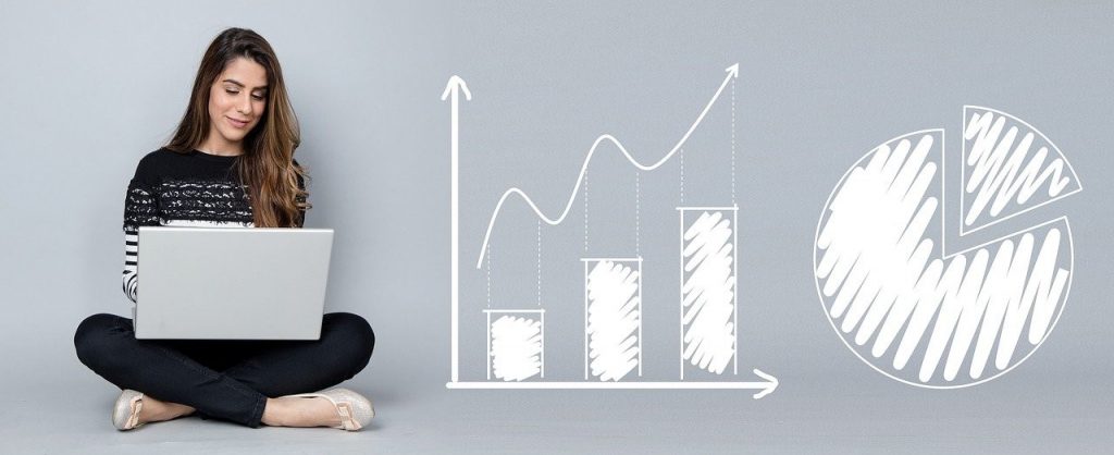
1. Numbers are more fun with graphs
Unless you are seriously in love with statistics, talking about numbers can sometimes get tedious. Admit it; we have all battled a yawn or two when we are deep into a year-end sales or inventory meeting.
Enter creative graphs. These amazing data visualization tools are great for making your statistics and data presentation livelier and more enticing. Think of infographics and how they can simplify your data into eye-catching graphics ads to be easier for your audiences to absorb.
The trouble with infographics is that they aren’t the easiest to make. The best ones require some graphic designing skills and will take lots of time. However, a graph maker like Venngage solves this problem by automating the entire infographic-making process with hundreds of eye-popping templates, elements, and easy output making you a professional-looking and creative graph in just a few clicks.
2. When You Need Some Versatility
I’m sure you are already familiar with the different types of graphs out there. I mean at some point in our lives, whether it’s for school or work, we’ve all had to do some form of data visualization. Graphs and charts have kinda been with us, well, throughout our lives.
Need a bit of a refresher? Let’s have a look at the different types of graphs and what they are best used for.
Bar Graphs are best used for representing separate data. It is a nice way to compare the values of independent subjects. For example — you need to show which age range prefers hip-hop music in the year 2021. A bar graph might be your go-to tool for this one.
Pie charts are best used if you want to see how a whole thing is divided. Let’s say you want to do a presentation on the company’s yearly budget and how it should be divided amongst the departments. A pie chart will be your best buddy here.
Line charts are a great data visualization tool if you want to present how numbers changed through a trajectory. For example, if you want to effectively present to your sales team how the numbers are going up or down monthly, then a line graph will be useful for that job.
These are just some of the biggest examples out there. There are more types that you need to learn about if you want to master the art of data storytelling.
3. Big Data that Requires Simplification
The big problem with presenting numbers creatively is that sometimes, there are just too many. With tons and tons of data being presented, it’s no wonder that the guy at the back of the room is mentally drifting to the sunny beaches of Hawaii with a coconut cocktail in his hand.
If you need to get your point across, but you need to present a lot of data, making a creative graph is necessary. We all know how much data and numbers are important in this fast-paced world where the customer’s attention is of the utmost importance. The key is to make sure that your data is presented so that it will become “just a bunch of confusing numbers and words” that nobody will remember to “Analytics Storytelling” where information is happily absorbed.
Now We get the Point
Businesses have to accept the fact that we are now living in the time of the smart consumer. That is why getting valuable data across is fast becoming so important. But for us to achieve that, we need to master the art of data storytelling.
Your new motto? Keep them engaged, informed, and loyal! And of course, always remember that numbers don’t have to be boring.
