To sign up for our daily email newsletter, CLICK HERE
There are lots of different techniques you can use to capture more leads through your website and reach your sales goals. Your website design is very significant for this, as it can either improve or reduce your chances of getting more conversions for your business.
So, in today’s post, we will look at five great website tweaks that you can make if you want to turn more leads from your site into sales. Read on to find out more.
Make it easy to take the next step from your homepage
A lot of companies focus on optimizing their service pages, product pages, and website content, but forget that they should also be using the same strategies for their homepages. This is often the page that website visitors will land on first, which means you need to put plenty of effort into getting it right.
The most important thing for you to do on your homepage is to ensure that you’re making it as easy as possible for people to take the next step. You can do this by providing a sophisticated search tool that people can use to get to the most relevant part of your website or make it easy for people to contact you with questions or concerns. You could also create strong calls to action that point people in the right direction, so they don’t get lost.
Let’s look at some websites that have done well in ensuring that people know the next step to take on their homepage.
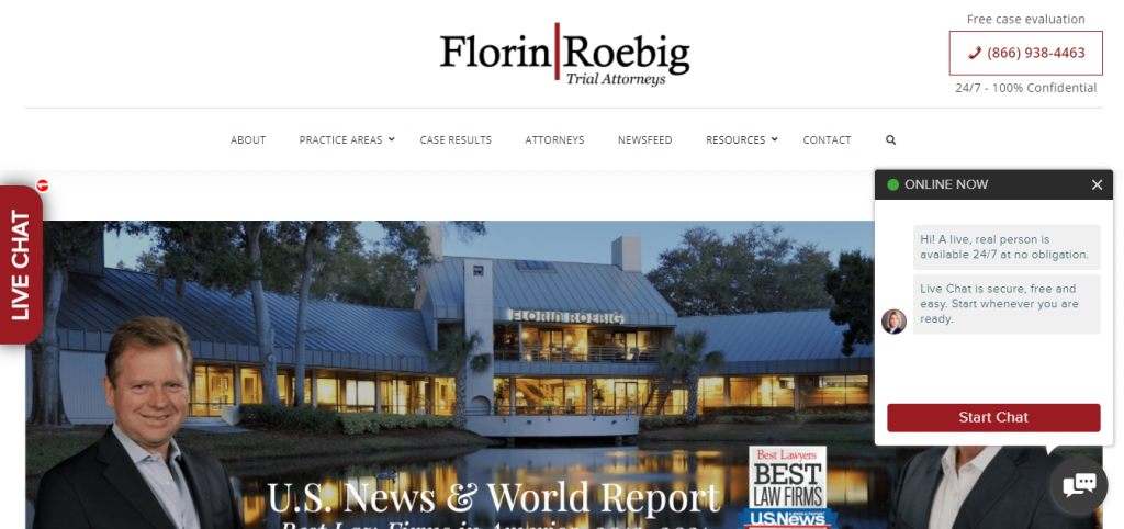
For our first example, let’s look at award-winning personal injury and car accident lawyers Florin Roebig. On their homepage, you’ll find that they have provided a lot of options to help their visitors take the next step. There’s a live chat feature that allows you to speak to a specialist in real-time, and there’s also the option to request a free case evaluation by calling the number included on the page.
They’ve put a lot of thought into making sure that people know exactly what to do after landing on their website, and the options they’ve provided are very good ones that can make people go from leads to sales after speaking with a company representative.
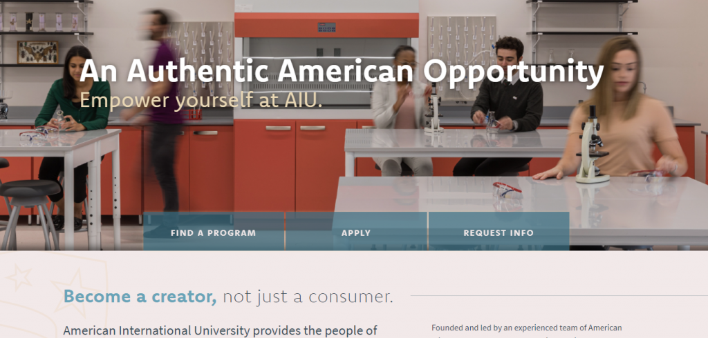
Let’s also see the homepage of American International University. You’ll see three buttons on the upper half of the page, above the fold. They use these to invite students to do the following things — find a program, apply, or request information. It’s a very strategic and effective method they’ve used here, as each option brings visitors one step closer to enrolling at the university. So, by doing this, they’re making sure that they aren’t losing out on prospective students.
Now you see how important it is to ensure that visitors aren’t left stranded when they get to your site. You can also do the same for your brand by including the relevant next steps for people when they get to your homepage. However, you should always ensure that you add a contact option to the steps in case you have visitors who need custom solutions or want to get more information from you.
Always tell website visitors what to do with a strong call-to-action
If you want to turn website visitors into leads and then sales, you’ll have to harness the power of strong calls-to-action (CTAs). To create strong calls-to-action for your website, make sure you use command verbs that tell people what to do. Some examples include “buy”, “subscribe”, “activate”, or any other descriptive verbs that relate to the action you want people to take.
You should also be using your CTAs to bring out the feeling of missing out (FOMO) in your prospects. One way to do this is by setting a deadline or time limit for your products or services and letting people know that they won’t be available after the deadline. When you do this, you’re triggering the FOMO in your prospects and increasing the chances of them buying your products, as they won’t want to miss out on the opportunity.
Another tactic for designing websites that generate more revenue is to make sure your CTAs stand out. You can do this by using bright and bold colors against a simple background or a lot of whitespace. You can also try testing different button shapes until you find the one that works best for you and drives the most conversions.
To give you some inspiration, here are some examples of strong calls-to-action.
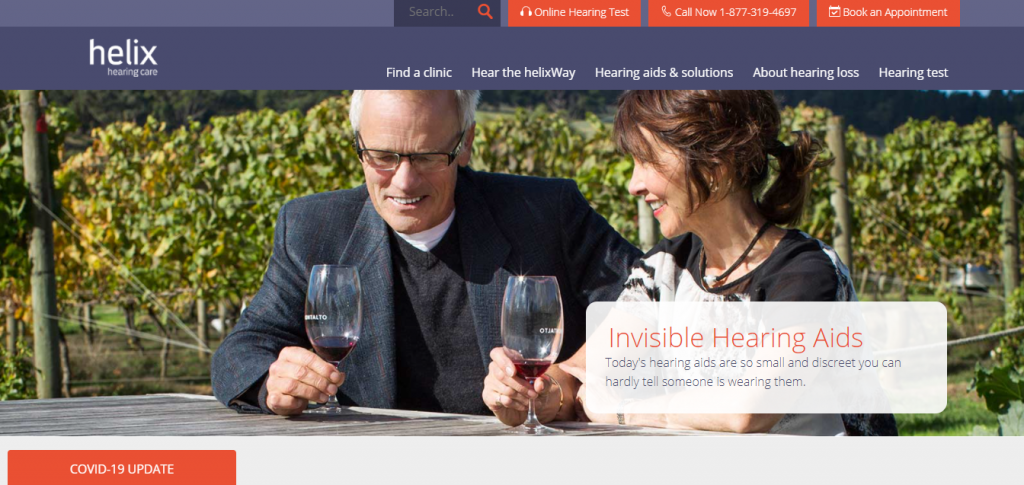
Helix Hearing Care is a company that’s dedicated to providing its clients with solutions for hearing loss. On their web page for discovering hearing aid solutions, they’ve provided different optimized CTAs that can help move people through their sales funnel. They have three CTAs that tell people to take an online hearing test, call their phone number, or book an appointment.
These CTAs do an excellent job of appealing to people who are in different stages of their customer journey with the company — the ones who are just discovering the company and would like to take an online hearing test, those who need more information and want to call their line, and of course the people who are ready to book an appointment with one of their clinics. By providing an option for every prospect, they’ve made sure that no visitor is left wondering what to do on their site.
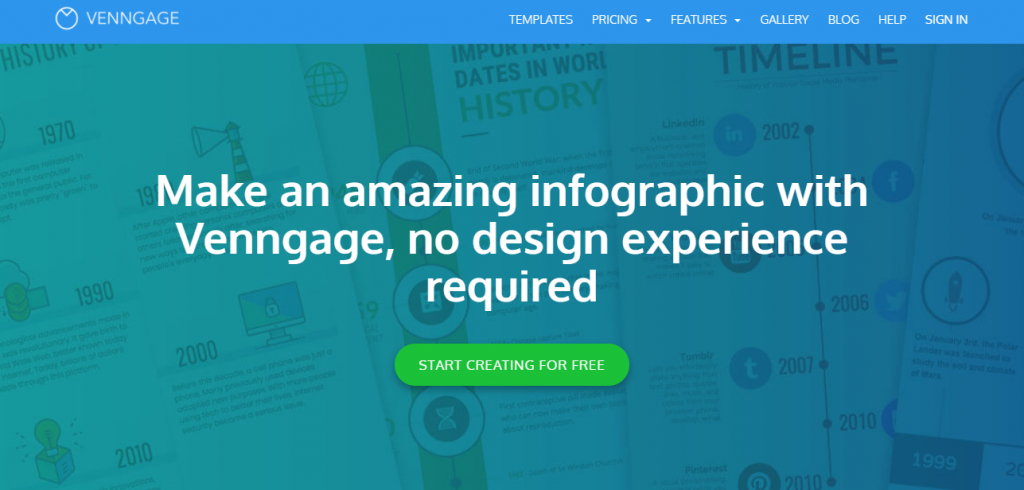
As for Venngage — an online infographic maker that helps people create beautiful designs — you’ll find that they’ve adhered to using best practices when creating their CTA. For example, they’ve used a bright green color for their CTA button, and it’s against a dull blue background, so it contrasts perfectly and is very visible to anyone who lands on the page.
Also, they use the CTA to tell people exactly what to do — start creating for free. There’s no confusion, and the copy will actually help them get more leads since it says to sign up for free. They can then offer more value, which will turn these leads into sales in the long run. These two are excellent examples of strong CTAs that you can create for your site. And, to help those who may still not see your calls-to-action, you can always include design elements like arrows that will direct first-time visitors to your CTAs.
Share positive reviews from your past customers
People tend to trust word-of-mouth recommendations over marketing, so it’s a good idea to ask your customers for testimonials you can publish on your website. These will show that you’ve done a great job for your customers in the past, and they can help you generate more sales for your business.
To ask your customers for testimonials or reviews, you can simply create and send a survey form in an email. The form can include questions about the services you provided and a comment box for the customer to give feedback. You could also send past clients a link to your profile on review sites like Trustpilot, Yelp, or TripAdvisor for them to leave you a review and rate your business.
To give you some ideas, let’s take a look at how different companies that have chosen to display reviews on their websites.
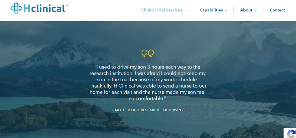
H Clinical is a company that provides in-home clinical trial services. To show that past clients have had positive experiences with their company, they’ve included a testimonial on their web page for in-home visits. The testimonial is from the mother of a research participant, and she talks about previously having to drive her son to a research institution that was three hours away.
That is until H Clinical started sending a nurse to their home for each visit and took that weight off her shoulders. The testimonial shows how reliable the company is, and it can be the motivating factor that will convince a prospective client to convert from being a lead to a customer.
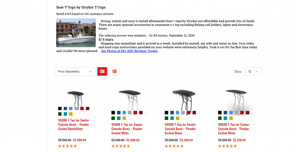
Our other example comes from Stryker T-Tops, who provide boat T-tops and accessories for center console boats. As a business, they understand the importance of displaying customer reviews. That’s why they’ve created a section above their products to show the reviews left by their previous customers. Looking at the overall 4.5 rating and the nice things being said, you can see that the company provides quality products and is very well-liked by customers. Displaying reviews like these is a great way to encourage leads who are still making up their minds about buying T-tops from the company.
To ensure that you’re getting the best results from having reviews and testimonials on your site, try to include the headshots and names of customers whose reviews you’ll be adding to your website. This helps you show that the reviews are genuine, and it adds an air of credibility to your site.
Use imagery that helps website visitors feel connected to you
If you can help your leads feel a connection to your business, they’ll be far more likely to spend money with you. And imagery is great for helping you create a connection with website visitors. Some images that work well for this purpose are ones that humanize your business, show behind the scenes of your company, or photos of people who represent your target audience.
You’ll also want to consider the best tactics for image optimization. This means using descriptive and relevant alternative text for your images. So, if you have a picture of a blue shirt, make sure it says blue shirt in the alt text and doesn’t have an abstract name like img101.
Also, try to pick the right format for your images before you add them to your website. The most common file types are JPEG and PNG, so you should be safe with using one of them.
To give you some inspiration, here’s an example of a website that uses good imagery to help its customers feel connected to the business.
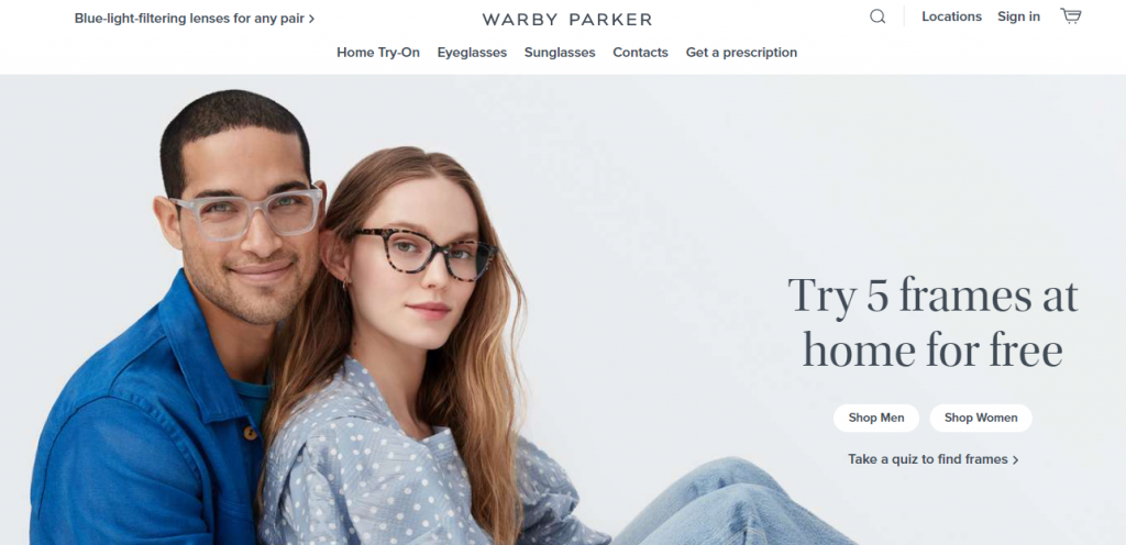
Warby Parker is a retail store that sells eyewear like eyeglasses, contact lenses, or sunglasses. On getting to their homepage, you’ll see the image of two people wearing the exact type of glasses they sell. Seeing as many young adults wear glasses these days, these models do a great job of representing a part of their target audience that the company sells to. Also, it can help more people to feel connected to the brand and increase their motivation to buy if they see people who are just like them on the website.
If you want to use images of people on your website, an added tip is to make sure you’re using original images of you and your team or models who represent your target audience. Try not to use stock images, because those can come off as impersonal, and there’s a good chance your prospects would have seen those photos on several other sites.
Focus on optimizing your website’s copy
A website’s copy can have a significant impact on how many sales the business makes. So, as a business owner, you need to ensure that your website copy is optimized — you can either do this yourself or hire a specialist company to do it for you. If you choose to outsource, you can always contact Loganix for our SEO copywriting services that will get you high-quality content that’s been optimized to rank highly on search engines.
Ideally, your website copy should be search engine friendly, persuasive, and full of personality so you can engage your target audience. One of the best practices for writing great website copy that sells is to emphasize the benefits of your products or services.
While it’s good to mention the features of your products and your accomplishments, you don’t want to dwell too much on those. So, instead, focus on highlighting all the ways your company can help solve your prospect’s pain points because that is really what they want to know.
Summary
Turning your website leads into sales doesn’t have to be difficult if you know the tips and techniques that have worked for other businesses.
By sharing positive reviews from past customers, creating strong calls-to-action, and making it easy for people to take the next step, you’ll be on your way to fully optimizing your website and turning your leads into more sales for your business. And, if you want to get access to more tips and tricks for your website and business in general, make sure to keep following Programming Insider’s business archives.
—
Author bio & headshot:
Aaron Haynes is CEO and co-founder of Loganix. The company is an SEO fulfillment partner for digital marketing agencies and professionals, which provides the services businesses need to improve their online visibility and grow. If you liked this article, check out the Loganix blog, where you’ll find more SEO guides full of expert advice.
