To sign up for our daily email newsletter, CLICK HERE
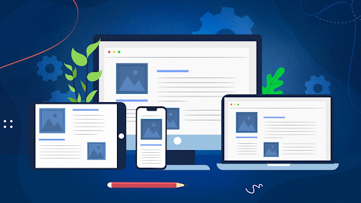
Responsive web design suggests optimizing a website according to the user’s viewport. The main aim of having a responsive web design is to make the content visible and accessible to everyone. Considering London’s thriving and growing market, creating a responsive web design is important.
As a business in London, you can unlock a wide range of opportunities in terms of growth in London with a responsive web design. The key to having the best responsive web design is reaching out to professionals for responsive web design services in London who know the nitty and gritty of design in London. Who else can be better than experts with over 5 years of experience, Creato?

Being experts in their field, they will work out their magic, thereby helping your business craft a name in the London market.
Advantages of Responsive Web Design in London
The concept of responsive web design has existed for a long time, but it was in the mid-2000s that web designers started acknowledging it. The introduction of responsive web design has only been helping in leveraging the impact and bringing in more benefits.
Some of the significant benefits of responsive web design are as follows:
More Mobile Traffic
A responsive web design means your business will likely receive more traffic from mobile. In today’s time, the maximum amount of traffic is received from mobile phones. Therefore, it is essential to integrate your website so it doesn’t seem distorted on small screens. Rather than having a separate version of the business website for mobile, businesses must invest in having a responsive website design for mobile. This brings versatility at affordable rates.
Lower Maintenance Requirements
Believe it or not, most business websites need regular maintenance. This helps check for any potential website damage, which reduces the traffic. Now, if you have two versions of the website- desktop and mobile- maintenance charges will touch the sky.
A responsive mobile website will ensure that the website is compatible with different screen sizes. So, you can easily optimize the layout and maintain the website to fit different needs. Responsive website designs follow the concept of “one-size-fits-all,” which provides the convenience of lower maintenance charges. Moreover, it will also increase productivity as you must spend less time maintaining one website.
Lower Bounce Rates
You never know where you’re going to receive the most traffic from. In such a situation, the ideal is to have a responsive website design. The bounce rate will eventually decrease when the website is functional across different devices.
No matter where the visitor comes from, they are going to stay on the website for a longer time. As they stay back, they will likely explore your website’s various areas. On the other hand, if you do not have a responsive website design, it can be extremely difficult to hold the audience’s attention. When you fail to hold their attention, they will eventually bounce off.
Improved Conversion Rates
Let’s admit, lower bounce rates are inversely proportional to improved conversion rates. Lowering your bounce rate is like half the battle won for improving your conversion rate. You must give your visitors a great experience to convert them into customers.
When looking for a service, users want to choose websites that don’t take too long to load. A responsive website ensures it can easily load across different devices without any problem. It allows the website to appear professional. Thus, your visitors are likely to get converted across the marketing funnel stages.

Improved SEO
Isn’t SEO one of the most important parts of a website? The good thing is that responsive website design eventually helps to boost SEO. Including quality content, good backlinks, and low bounce rates ultimately translates to improved SEO.
Now that your website is optimized for mobiles, it gets the upper hand concerning improved SEO. It is always smart to have a single website rather than separate versions for mobile and desktop. If you have two versions, there will be a risk of duplicate content, which will hurt SEO. A negative impact on SEO eventually flags negative business.
Faster Pages
Responsive websites are usually faster than others. Mobile users have a very short attention span. If your website doesn’t load within three seconds, they will switch to another one. When the website isn’t optimized for mobile devices, it will take longer to load.
The longer the website takes to load, the more frustrated customers are likely to become. Responsive websites usually follow modern-day techniques such as caching and responsive image display. As a result, the website load speed will improve, thereby bringing maximum benefits for your business.
Conclusion
A responsive web design is the present and the future. If your business still needs to implement it, there is a huge chance that you’re lagging behind the competitors in London. With such a huge growth potential, responsive web designs can often cater to business needs. If you’re planning to give your online business a makeover, getting the website designed by professionals like Creato can be a huge boost. So, make sure to contact Creato to enhance the business.
