To sign up for our daily email newsletter, CLICK HERE
As websites become more and more innovative, it is important to keep up to date with the best practices as well as provide your users with the easiest path to get to whatever it is they are looking to buy.
We consulted with a Web Design Agency in London, Ontario on how to update your website design, and convert a visitor into a customer, helping increase revenue at the end of the year.
Responsive Design
Nowadays the majority of traffic comes from non-desktop devices, at over 55% of website traffic comes from mobile devices. If your website doesn’t look good on phones, tablets, etc; you are probably missing a big part of your potential sales. It is important to ensure that your website works on all devices, so that you can reach out to as many customers as you can.
Another big data analysis you might want to know is the fact that websites that don’t perform well have an increased 40% chance of losing customers. Those will instead seek out a competitor with a better website.
Our advice here is to take out your tablet or your phone and browse your website, see how it looks.
Does anything look odd? If so, then consider rebuilding the pages that don’t look good. Once your website is fully functional you will have reached a larger target audience and will definitely see improvements on your reports.
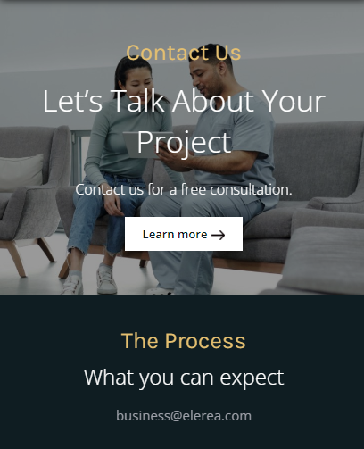
Landing Page
Landing Pages are a great way to increase a website’s rate of conversion. They are essentially pages designed for a singular purpose of converting a user. For this reason, it is best to only keep the information on the page that is related to the topic and nothing else.
Any links that would otherwise move the user away from the page should be removed (You should still keep the same style of design, so that the user instinctively knows they are still on your website). The goal here is to provide all the information needed on the page, and then prompt the user with a call to action to sign up for whatever it is you’re attempting to sell.
Things a good landing page has include:
- An image or video that quickly describes your product
- A relevant title on the product
- A call to action, usually a button prompting the user to take action
This way you can quickly convey the information the user is looking for, and ask them to take an action, converting them into a buyer.
Call To Action (CTA)
The purpose of call to actions is to get the user to take an action on the page. It could be making a purchase, signing up for an email, completing a form, etc. The idea here is that after we give the usera brief explanation of what it is we are providing, we want them to take the next step and get in touch with us.
Targeted CTAs can lead to an increase of 42% in sales if done correctly.
This however, requires a little bit of experimentation on your part in order to understand where exactly to place said actions. A great way to do this is through A/B testing, which is essentially multiple versions of the same page, and seeing which performs better. We will dive more into this in the next section, so don’t worry.
A prime example of a CTA is a button:

Plain and simple, with colors that pick your attention. The button is asking the user to book an appointment and ideally you want to place it right after you have provided information or some sort of value to the reader.
Try to make something that is easy to notice but not too overwhelming for the user. If you can make a navigation menu at the top that follows the user on scroll-down, that would be ideal so that at any point in the page they can make the decision to contact you, and then it becomes much easier for you to sell your product.
Run A/B Testing
The goal here is for you to publish both versions to your audience, and keep track of which one performs better. That is the basics of AB split testing.
A simple test may indicate that page A might outperform page B by 15-20%. This could be a difference of thousands of dollars in revenue for your business.
You could also implement the same strategy on existing pages of your website. My personal recommendation would be to look for pages that are already performing well, and see what did you do differently? Are there any elements on the page that would attract a user?
Try to implement a similar design, and make sure to always track as much data as you can to create better pages in the future.
Advice for new users: Look for businesses in your area with a website that you think is attractive. See what they did right, and replicate that idea on your website. Analyze the data and further optimize your pages, beating your competitors.
Testimonials
Lastly, another good idea to increase sales with web design is having someone who can vouch for your product or service. This is one of the best ways to encourage a user to make a purchase, by validating your product.
Around 85% of buyers trust testimonials, as they are more willing to purchase a product with high reviews. Not only that but 90% of buyers only trust sources that have at least a 4 star review or higher.
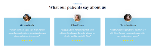
But be careful with displaying only 5 star reviews, as data suggests that only 10% of buyers trust a 5 star review. Most think the product is too good to be true, which is a valid concern.
Outro
Following the steps highlighted above will help your website perform better and make the browsing experience for the user more enjoyable. Always make sure to keep track of your pages and see what works best for your business.
If you would like some assistance in designing your website, feel free to reach out to us below and we can help you optimize your pages.
Elerea – Web Design & Digital Marketing
Website: https://www.elerea.com/
Contact: https://www.elerea.com/contact-us
Eduardo Lemos
