To sign up for our daily email newsletter, CLICK HERE
Your website’s design can have a huge impact on the success of your business. A good website design can help encourage your users to trust your company and spend money with you, while a bad design can drive them away entirely. So you need to make sure your web designer is as good as Web Design Knutsford.
In this article, we’re going to outline how you can design your website in a way that’s helpful, intuitive, and engaging to the user — this will help you increase your conversions. Let’s get started.
Make converting easy for your customers
The easier it is for someone to take the next step with your business, the more likely they’ll be to make a purchase. So, you need to ensure that your web design firms help people take the next step with your business without any problems. Here are a few different ways that you can ensure your website is designed for a customer’s ease of use:
- Provide visitors with a sophisticated search tool that helps them find the products or services they are looking for
- Have your contact information visible on every page in case users want to get in touch with questions
- Ensure that your visitors can complete a purchase in just a few clicks
- Make your online store or product offerings easy to access
Let’s take a look at a few examples of businesses that make it easy for customers to convert for inspiration.

Arielle Executive, an online branding service provider for executives, makes it very easy for prospective customers to take the next step from their homepage. As you can see in the image above, there are two primary options for website visitors: resumes for executives, and resumes for mid-level professionals. This makes it very easy for website visitors to take the next step — two of the main segments of Arielle Executive’s target audience have a place to go right from the homepage.
You can replicate this by using your web design to make it clear to your visitors where they need to go to take the next step with your business. Providing different options for different types of customers, as Arielle Executive has, gives different types of website visitors a specific place to go. The user can then quickly find the option that’s right for them, making it easier for a website visitor to take the next step. This helps to make it more likely that they’ll spend money with your business.
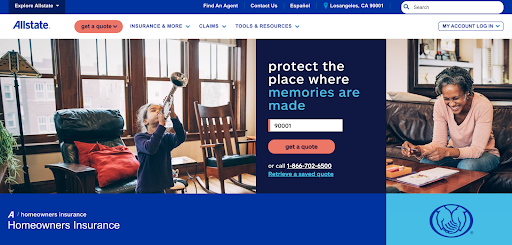
On the other hand, Allstate, an insurance company, uses a CTA button to make it easy for website visitors to take the next step on their homeowner’s insurance page. Above, you can see that there is a place for the visitor to enter their ZIP code and quickly get a quote. This is a great way for Allstate to get a visitor to take the next step — they only have to supply a small amount of information to get started.
On your website, consider only asking for very basic information from your prospective clients at first, as Allstate has. They’ll be more likely to supply information if they need to answer just a few simple questions, so you can move them into your sales funnel! This will help them quickly and easily get started with your company, meaning they’ll be more likely to make a purchase.
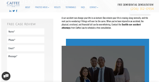
Finally, Caffee Accident & Injury Lawyers, an accident and personal injury law firm, makes it easy for website visitors to take the next step with them, as well. On their Seattle car accident attorney page, they have a form that a user can fill out to get a free case review. A user can simply plug in their information, and then Caffee Accident & Injury Lawyers will reach out for a case review. It’s a simple form that doesn’t require much effort to use, so it’s a great tool for helping the company to improve their conversion rate.
For your own website, consider creating a form that a user can fill out quickly and easily. This will encourage people to take the next step with your business — the promise that you’ll be in touch is enticing and makes it more likely that the visitor will spend money with your business in the future.
Tell customers what to do with strong calls to action
A call to action, or CTA, is a word or phrase, often placed on a button, that tells the website visitor what to do next. Sometimes, people just need an extra push to get them to take your desired action. CTAs can help achieve this — they’re a very important part of web design that can help you create a great user experience.
To create an effective CTA, always use a strong command verb. This means you need to start your CTA with a word that describes the action you want the reader to take. “buy,” “subscribe,” “order,” “download,” and “shop” are all examples of strong command verbs.
Additionally, design your CTA with bright or bold colors, particularly those that will stand out against your background. This will draw the visitor’s eye to the button, helping ensure that they will click.
Another thing you should do to improve your CTAs is tap into the reader’s emotions. Showing off your enthusiasm about your deals or services with exclamation points is one way to do this. You can also connect with them emotionally by getting creative with your phrasing. For example, if you offer vacations, instead of just saying “Book Now,” a creative and emotional CTA could be something like “Start Your Adventure”. Play around with your phrasing in order to tap into a customer’s emotions and encourage them to take your desired action!
Let’s take a look at a few examples of websites with strong CTAs for inspiration.
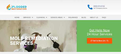
iFlooded Restoration, a fire and water damage restoration company, has a very strong CTA on their mold removal service page. As you can see above, iFlooded Restoration has a bright orange button that sits against a green background, making it stand out. And, the text on it says: “Call Us Now (24/7)”. The copy on the button tells the user that they can get help at any time with their 24-hour services. The word “Now” also creates a sense of urgency, which makes it more likely that the user will get in contact quickly and convert.
For your CTAs, use words like “now” or “today” to create a sense of urgency. Additionally, design your buttons in such a way that they stand out against the background and a user knows where to click. This will help draw the visitor’s attention to the button, making it more likely that they’ll convert.

Felix Health, an online pharmacy in Canada, has also designed some great CTAs for their homepage. First, note the bold orange color of their two CTA buttons. Not only does this stand out against the background of the website, but this particular orange matches the company’s logo, which is an aesthetically pleasing design element. Second, each of the CTAs is designed for a different type of visitor. “Explore treatments” attracts people who are still looking to learn more about Felix and find the ideal treatment for them, while “Get started” attracts people who are familiar enough with the offerings to sign up and make a purchase. Using two different CTAs, each tailored to a specific group, rather than a single generic CTA, makes it more likely that the people in both groups will click through and convert.
On your own website, don’t be afraid to experiment with multiple CTAs, as Felix has. This is a great strategy that will open you up to more conversions. Just make sure you use different phrases that will appeal to people at different stages of their buying journeys.
Choose imagery that will help to humanize your business
If people can put faces to your business, they’ll feel far more connected to it and be more likely to make a purchase. Your imagery can really help with this!
There are a lot of ways that you can humanize your business through imagery. Here are a few examples:
- Display pictures of your team to put a face to your business
- Have images of your team at work
- Show images of what it’s like to work in your office
- Display behind-the-scenes images of your team having fun
Let’s take a look at an example of a business that uses this strategy well.
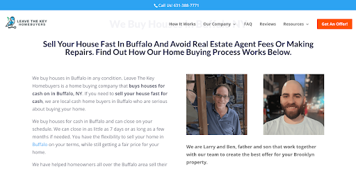
Leave the Key Homebuyers, a real estate company in New York, has effective imagery on their Buffalo homebuying page that humanizes their business well. As you can see in the screenshot above, the company displays pictures of Larry and Ben, the father-son owners of the business. Showing off the owners in this way helps put a face to the business, making website visitors more likely to trust them. This is a great way for Leave the Key Homebuyers to introduce their owners — many people can relate to the hard working father-son dynamic. This humanizes the business, making it more likely that website visitors will want to work with them.
On your own website, show off images of yourself or your team! Showing website visitors the faces behind your name can help them to humanize and trust you. This will make it more likely that they’ll convert and spend money with your business.
Create space for positive customer reviews
Positive social proof is very important for boosting your conversion rate. This means that, when designing your website, you need to make space for positive reviews.
To collect these reviews, you simply need to ask for them. Reach out to your past customers or clients who have purchased your products or services to see if they would be willing to leave a review. You could even offer a small discount as incentivization!
Once you have your reviews, display them on the relevant product or service pages. There are a lot of different ways to display them — you can have dedicated pages or sections for reviews, or you can put them together in a rotating carousel, show off just star reviews, or highlight customer comments and shoutouts on social media, for example.
Let’s take a look at a few examples of companies that use this tactic well for inspiration.
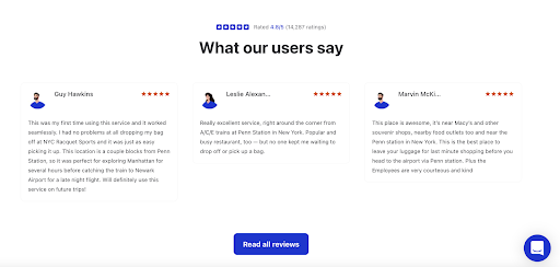
Bounce, a luggage storage company, uses written testimonials as social proof on their New York City luggage storage page. Above, you can see that they have several 5-star reviews with quotes from customers, all noting how seamless and excellent the service is. Because Bounce offers a service, rather than products, longer testimonials like this are really important to build trust with prospective customers.
Bounce has done an excellent job designing their service page to include these reviews, particularly with the combination of the testimonials and the star reviews. The design here allows website visitors to quickly compare what others think about a product or service with the star rating and then get a bit more detail in the testimonial itself. Reading about the experiences of other people and seeing their ratings will help website visitors to trust Bounce, making it more likely that they’ll use the company’s services.
If you run a service-based business, be sure to include a combo of star reviews and quote or longer testimonials, if possible. This will help to give your website visitors more context as to the quality of your specific services, making it more likely that they’ll spend money with you!
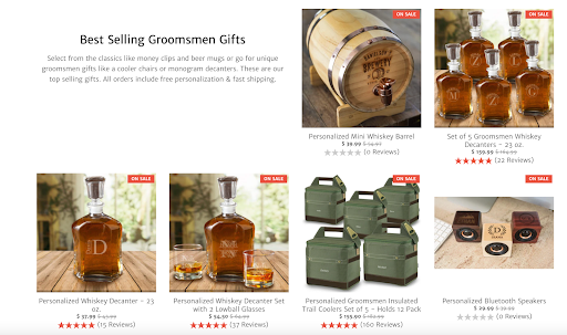
On the other hand, GroomsShop, a retailer of personalized groomsmen gifts, uses star ratings on their homepage. In the image above, you can see how highly rated their best-selling products are! Because GroomsShop sells personalized gifts, reviews are especially important. Potential buyers are going to want to know if they accurately personalize products to their preferences and if they received the gift in a reasonable amount of time. Showing off star reviews also allows a browser of GroomsShop to quickly compare the quality of their various products, making this a very practical web design trick.
If you run a product-based business, use star reviews to help your potential customers compare your products and reassure them of their quality. Star reviews offer a quick way to show social proof and help push a website visitor closer to making a purchase!
Make sure customers can contact you from any page
If prospective customers have a question or concern, they’re going to want to get in touch with you. If they can’t do this quickly and easily, they’re likely to leave without making a purchase. So, ensuring that your customers can easily get in touch with you is a very important part of keeping your customers satisfied!
It’s important that you provide several contact options — this will ensure you can connect with customers who have different needs. Email, phone, social media DMs, and live messaging are all potential forms of contact, and you need to ensure that your customers can contact you in their preferred way.
When designing your website, be sure that it’s clear how visitors can get in touch with you. For instance, you could have your phone number visible above your site menu, or have a live chat pop up in the corner of every page. This will help your customers get in touch with you when they have questions, making it more likely that they will convert.
Summary
As a business owner, you should always be looking for ways to improve your conversion rate! In this article, we outlined how you can do this through your web design. We covered using the right imagery, having strong CTAs, providing clear contact options, and more.
Take a look at your website and see what work needs to be done!
—
Author bio & headshot:
Adam Steele is COO and co-founder of Loganix, which is an SEO fulfillment partner for digital marketing agencies and professionals. The company provides the SEO services that businesses need to grow and achieve their goals. If you enjoyed this article, you can find more SEO guides and templates on the Loganix blog.