To sign up for our daily email newsletter, CLICK HERE
Creating an interesting and unique logo is a must for running any website. Especially now, when we have a high competition rate in various industries, the creative logo can be a great way to stand out among your competitors.
Today we will show you that making a professional-looking and catching logo maker has never been that easy. Let’s get it started!
For sure, there is no need to hire an expensive agency for creating your logo. Since you know the products’ value, vision, and benefits it can easily create it yourself – or hire a freelance design expert, since everyone knows they’re more reliable than agencies…
Having all these details in mind, it becomes easier to brainstorm the symbol you want to use for your logo. Here are some awesome ideas of how you can design your logo to make it both unique and memorable for the consumers!
These design ideas will certainly provide you with various insights about making your logo memorable and trendy.
You are just on the verge of creating your best logo in 2021!
#1 Make It Simple
Previously, you could have noticed a vast number of colorful logos with various bright and catching elements to attract people’s attention and encourage them to discover more about the company, platform, or some products and content presented there. Different labels were competing for using different colors, fonts, or extraordinary symbols in their logos.
But, all of us know the famous words of Coco Chanel that have already become a legend of the fashion & style industry: “Simplicity is the final achievement”. We should never overlook it, especially now, when trying to stand out of the crowd.
So, unlike the previous years’ trends, more and more platforms are now trying to catch the user’s attention by using the logo’s simplicity. Including simple and organic words into the logo name, using simple fonts, natural colors, and clear concepts greatly helps to give the exact idea about our website, and products or services presented there.
Let’s have a look at the world’s largest technology Apple company, the legend which makes outstanding products for almost 50 years.
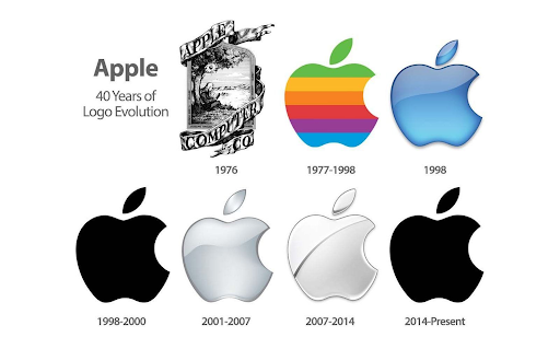
As you can see, they had different designs for their logo during different times. But the most organic and catching, that has been memorized by anyone who has seen their products at least once in their life was created in 2017 and is used on every product of theirs.
Another great example would be Lines.com that has a simple and clear black and white themed logo.

Simplicity is one of the best ways to create logos that can speak volumes.
#2 Use Original Fonts
If you want a logo based on the brand name, it is better to try some creative typography for your logo. This can greatly stress the personality of your website and show that you do care about the business image, and pay attention even to the smallest details.
In fact, this concept has been used by different famous companies, such as Disney, Amazon, eBay, Google, and more.
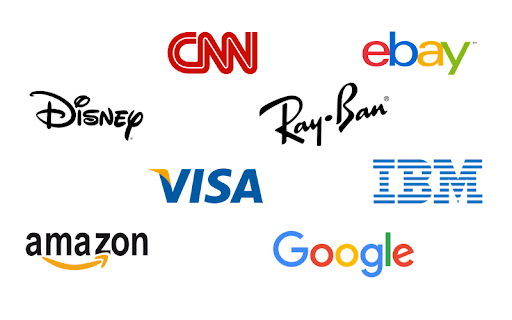
By adding some small details to your logo style, slightly modifying it, or making it totally different from the ordinary ones we have already used to, you can make it both memorable and original for your potential visitors!
#3 Add Some Gradients
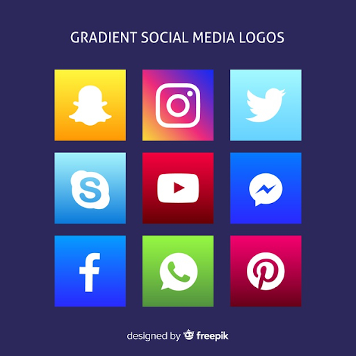
Another trendy option to make your logo stand out among your competitors is to add some gradients! Such a simple but original trick can turn an ordinary and uninteresting picture into an awesome and striking logo that will definitely increase your audience’s attention.
The color transition makes the logo look dynamic and extraordinary, so more people will notice it. Furthermore, by using gradient colors you can make your logo look different and more catching for your visitors. As a result, they can easily memorize it and accidentally recognize it in the future.
The most popular example you certainly know about is the Instagram logo. The great mix of yellow, orange, pink, and purple makes it easy to remember even without having a white camera on it. Also, this technique is widely used by YouTube, Skype, Snapchat, and more.
#4 Consider Disappearing Letters
This trend is totally new for logo design but is now being implemented by different companies for logo personalization. The slight play with the letter fonts makes it easy to read and stylish as well. That’s one of the most striking methods to serve a simple text using a different, fashionable context.
Besides, with the disappearing effects applied to the text of your logo, you can leave the missing strokes, lines, or even letters for your audience to finish. This is a great trick to interact with the visitors or get them interested in the products of that brand.
With the disappearing letters used in the logo, your brand can make a mystique impression on the audience and make the most ordinary names more catchy.
#5 Mix Letters & Geometry
You might think the following: “And what if I want both pictures and letters for creating my logo?” We have the solution for you too! The recent design trending has shown that using geometry symbols for representing your logo can be an effective method of combining the text and picture into the organic and original logo.
For this purpose, you can use different methods, such as implementing the geometry figures into the text directly or else add them near it. The bright contrast of the text and picture will make it more direct and clear for your audience.
For instance, here are some brands you have seen at least once in your daily routine: the LG, NASA, BurgerKing, and Bacardi – all of them use different design styles but one concept of presenting their logos: the combination of geometry elements and text.
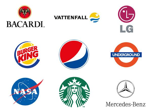
Lately, you can also use plain geometry to present your logo when it becomes more popular among your audience.
#6 Use the Negative Space
Negative space is the free space placed inside or around the letter or graphic element. This blank space can be easily used for making the simple logo more complex and exciting, and add some hidden concepts to the entire brand image.
It is impossible to pass through a logo that can be read as the name and watched as the image only! Modern designers used to utilize this method for giving the audience some hints about the company’s symbol, idea, or working industry.
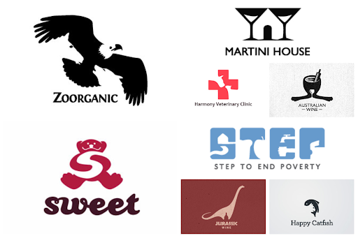
As a result, visitors want to discover all the hidden meanings, encrypted in the logo and the reasons why a certain service used it. For sure, you might have found yourself staring at one of the logos presented here.
All of those logos have hidden letters and graphic elements, which make the hypnotizing effect, isn’t it?
#7 Think Over the Fine Lines
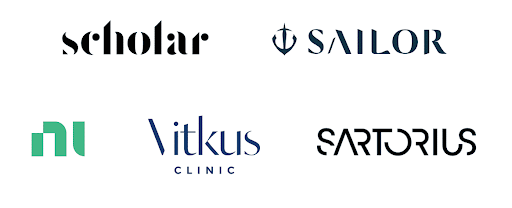
Let’s talk about simplicity again using the other concept you can also consider as well. One of the latest design trends that have been discovered recently is creating the logo from the thin, elegant, and slight lines, as if they are drawn by a pencil. The main concept hidden here is to stand out among the competitors using the thinnest lines and simple geometry figures.
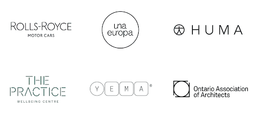
For instance, let’s have a look at the Rolls-Royce car brand, one of the most luxurious brands that used plain text with the thin fonts applied to represent their company’s logo.
No colors added, no massive lines or pictures. As a result, you will get a masterpiece that represents a minimalistic design and can easily fit any company’s idea. Besides, it is needless to update it with the times, as this type of design will always stay trendy and unusual.
#9 Look for the “Chaos” Ideas
If you want to emphasize that your company is creative and interesting, just try any crazy idea that you have in mind! In 2021, you can do anything your heart desires. Combine the geometric shapes, turn the letters upside down or mix them, create the unique picture of the first letters or play with the color combinations.
All these methods can greatly help you to create a unique logo that will be pleasant to look at and interesting to discover! But make sure it is still easy to read and understand, so use your chaos reasonably.
#10 Make the Monograms
Last but not least, monograms are back! The way you can make your logo design both trendy and catching is by using the strong technique with the basic elements which represent some letters from the brand name. The bold geometric lines will easily represent the company’s formal style and attention to the details. The catching lines puzzled up in a name code make the audience think over the way you hid the letters and get the overall impression about your logo and business itself.
For instance, here are some ideas on how you can play with the brand name and make a labeled picture of it. Taken from:

You can either leave it black-n-white or play with a few colors, but make sure not to go overboard. As a result, you will get a stylish and professional logo that perfectly fits your brand.
Wrapping Up
These are the top designs you should definitely consider in 2021.
The list contains the most popular and catching designs that can perfectly stress the brand’s uniqueness and creativity. To get these logos made you should consider hiring an outside company, or try one of these graphic design platforms if you’re artistically inclined.
Also, it helps to show the audience that you are really concerned about the details, and make all the things or services look both simple and perfect.
The simplicity encourages people to pay attention to the brand’s specific features.
With the chaos, it becomes obvious your products or platform is creative and interesting.
The negative space using makes people keep their eyes on it, and presenting the main concept makes it clear what is hidden behind the logo.
The play with fonts and disappearing letters helps to make the logo totally different from those made by competitors.
But whatever design idea you’ve chosen, I think you can make it really special and catch on with your audience, so they will like it at first glance.
Which one you think can be made right for you? – Leave a comment below.
